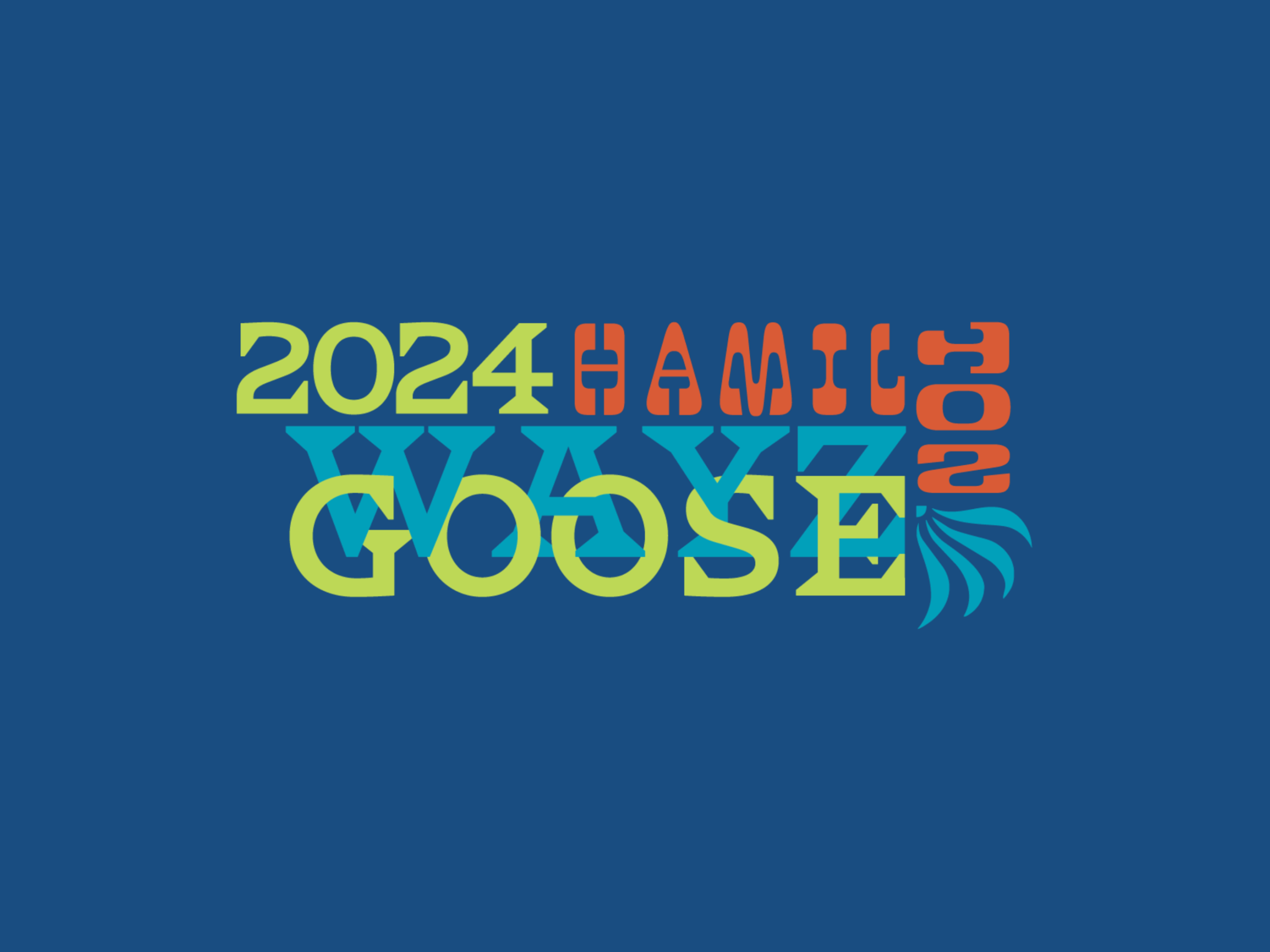
The 16th Annual Wayzgoose Conference
Typography | Brand Identity
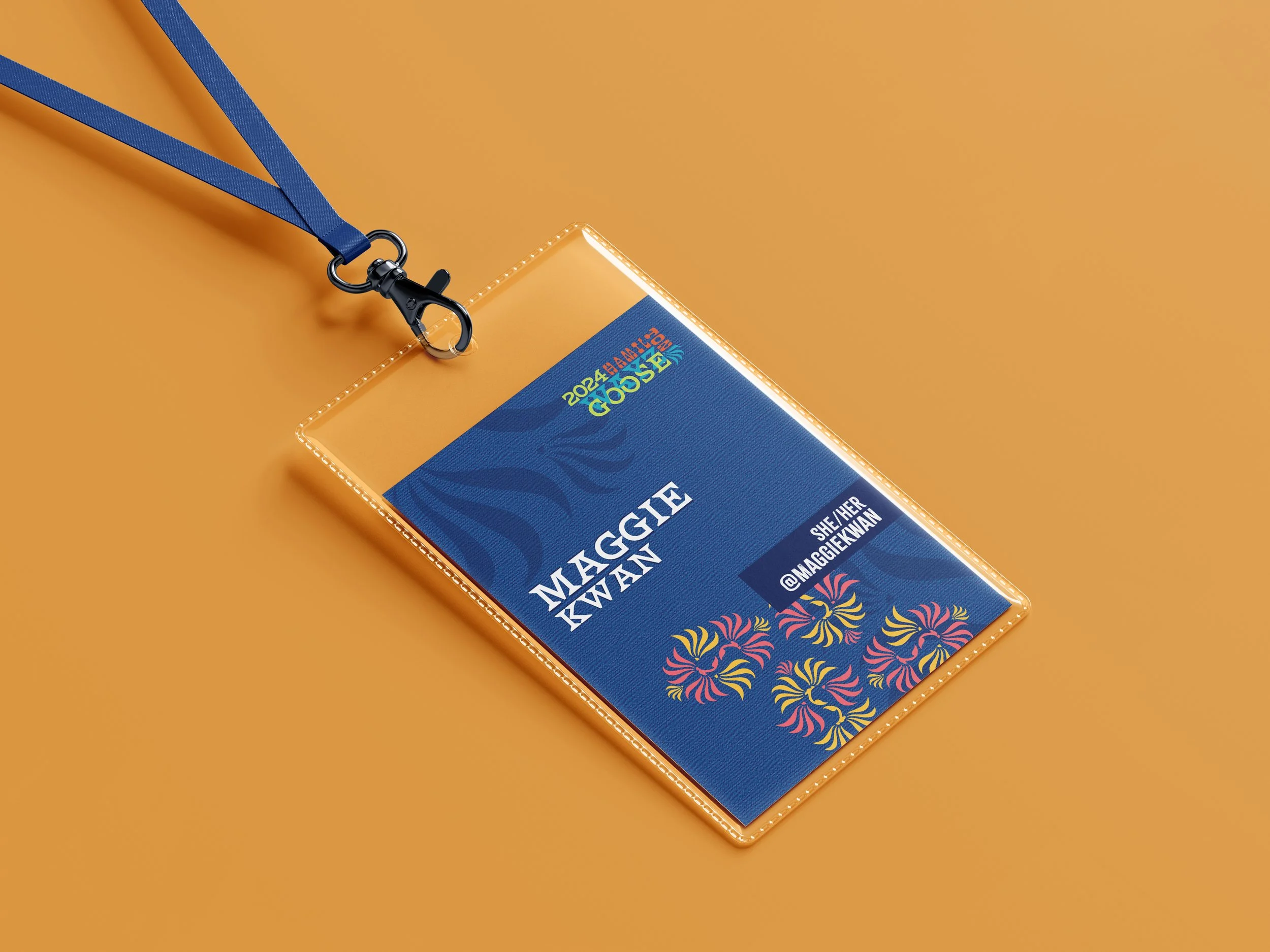
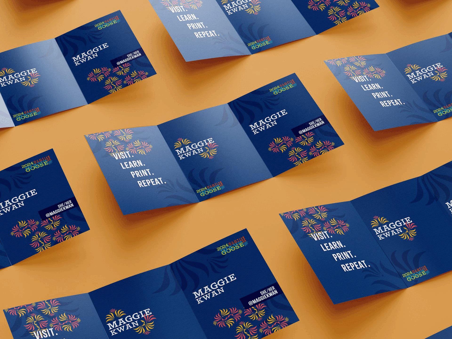
The goal of this project was to create a conference logo, name tag/schedule and webpage for Hamilton Wood Type's annual conference based on the museum’s visual identity. The museum is a place where wood type is cut and letterpress prints are created, instilling years of craftsmanship, creativity and innovation.
I created a vibrant and dynamic logo and utilized bold text to display important information and enhance the guest’s experience. Throughout the design, ornamental symbols that resembled goose were used to represent the imagery of goose eggs.